

Chapter 03 Number Play Solutions
November 5, 2024Chapter 05 Prime Time Solutions
November 5, 2024Chapter 04 Data Handling and Presentation Text Book Solutions
Page 75
Q1: What would you do to find the most popular game among Naresh’s and Navya’s classmates?
Ans: Students are encouraged to answer this question on their own, but here is a sample answer for reference:
To find the most popular game among Naresh’s and Navya’s classmates, the first step would be to collect data by asking each classmate what their favourite game is. This information would be organized into a list, just like the one shown in the image. Then, to determine the most popular game, we would count how many students prefer each game. The game with the highest count is the most popular one in the class.
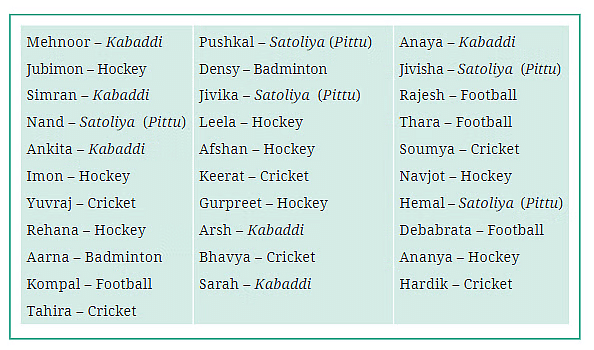
Q2: What is the most popular game in their class?
Ans: After looking at the data, we can see that Kabaddi is mentioned the most times. Specifically, there are 7 students who have listed Kabaddi as their favorite game. Therefore, Kabaddi is the most popular game among Naresh’s and Navya’s classmates.
Q3: Try to find out the most popular game among your classmates.
Ans: Students are encouraged to answer this question on their own, but here is a sample answer for reference:
To find the most popular game among my classmates, I would ask each of them what their favorite game is, just like Naresh and Navya did. After collecting the data, I would count how many students prefer each game. The game that is mentioned the most times would be considered the most popular game.
Q4: Pari wants to respond to the questions given below. Put a tick (✔) for the questions where she needs to carry out data collection and put a cross (✘) for the questions where she doesn’t need to collect data. Discuss your answers in the classroom.
a. What is the most popular TV show among her classmates?
Ans: ✔ (Data collection is needed to find out the most popular TV show.)
b. When did India get independence?
Ans: ✘ (This is a fact that does not require data collection.)
c. How much water is getting wasted in her locality?
Ans: ✔ (Data collection is needed to measure the amount of water wasted.)
d. What is the capital of India?
Ans: ✘ (This is a known fact that does not require data collection.)
Page 76
Q1: Complete the table to help Shri Nilesh to purchase the correct numbers of sweets:
a. How many students chose jalebi?
Ans: 6 students chose jalebi.
b. Barfi was chosen by how many students?
Ans: Barfi was chosen by 3 students.
c. How many students chose gujiya?
Ans: Gujiya was chosen by 13 students.
d. Rasgulla was chosen by how many students?
Ans: Rasgulla was chosen by 7 students.
e. How many students chose gulab jamun?
Ans: Gulab jamun was chosen by 9 students.
Q2: Is the above table sufficient to distribute each type of sweet to the correct student? Explain. If it is not sufficient, what is the alternative?
Ans: The table provided lists the number of students who chose each type of sweet (Jalebi, Gulab Jamun, etc.), but it does not include the names of the students who made those choices. Therefore, while the table is sufficient for knowing how many sweets to buy, it is not sufficient for distributing each type of sweet to the correct student because it does not specify which student chose which sweet.
Alternative: To distribute the sweets accurately to each student, you would need a list that not only includes the number of students for each sweet but also records the names of the students along with their preferred sweets. This way, you can ensure that each student receives the sweet they specifically requested.
Page 77
Q1: Help her to figure out the following –
a. The largest shoe size in the class is _________.
Ans: The largest shoe size in the class is 7.
b. The smallest shoe size in the class is _________.
Ans: The smallest shoe size in the class is 3.
c. There are _________ students who wear shoe size 5.
Ans: There are 10 students who wear shoe size 5.
d. There are _________ students who wear shoe sizes larger than 4.
Ans: There are 7 students who wear shoe sizes larger than 4.
Q2: How did arranging the data in ascending order help to answer these questions?
Ans: Arranging the data in ascending order made it easier to identify the smallest and largest shoe sizes and to count how many students wear each size.
Q3: Are there other ways to arrange the data?
Ans: Yes, the data can also be arranged in descending order, where the largest sizes come first, or it can be categorized based on frequency of each shoe size.
Q4: Write the names of a few trees you see around you. When you observe a tree on the way from your home to school (or while walking from one place to another place), record the data and fill in the following table —
a. Which tree was found in the greatest number?
Ans: The tree found in the greatest number can be determined after collecting and organizing the data in the table.
b. Which tree was found in the smallest number?
Ans: The tree found in the smallest number can be determined after collecting and organizing the data in the table.
c. Were there any two trees found in the same numbers?
Ans: This can be determined after filling in the table with the number of each tree observed.
Q5: Take a blank piece of paper and paste any small news item from a newspaper. Each student may use a different article. Now, prepare a table on the piece of paper as given below. Count the number of each of the letters ‘c’, ‘e’, ‘i’, ‘r’, and ‘x’ in the words of the news article, and fill in the table.
a. The letter found the most number of times is ________.
Ans: Students are encouraged to answer this question on their own, but here is a sample answer for reference: The letter found the most number of times will be identified by counting how many times each letter (‘c’, ‘e’, ‘i’, ‘r’, ‘x’) appears in the news item and filling in the table. The letter with the highest count is the one found the most number of times.
b. The letter found the least number of times is ________.
Ans: Students are encouraged to answer this question on their own, but here is a sample answer for reference: Similarly, the letter found the least number of times will be identified by counting how many times each letter appears in the news item. The letter with the lowest count is the one found the least number of times.
c. List the five letters ‘c’, ‘e’, ‘i’, ‘r’, ‘x’ in ascending order of frequency. Now, compare the order of your list with that of your classmates. Is your order the same or nearly the same as theirs? (Almost everyone is likely to get the order ‘x, c, r, i, e’.) Why do you think this is the case?
Ans: Students are encouraged to answer this question on their own, but here is a sample answer for reference: After counting how many times each letter appears, list the letters in ascending order, starting with the letter that appears the least and ending with the one that appears the most. When comparing your order with your classmates, it’s likely that many will have a similar order (like ‘x, c, r, i, e’) because certain letters, like ‘e,’ are generally more common in the English language, while letters like ‘x’ are less common.
d. Write the process you followed to complete this task.
Ans: Students are encouraged to answer this question on their own, but here is a sample answer for reference: The process to complete this task would involve the following steps:
Select a small news article and paste it on a piece of paper.
Create a table with columns for each letter (‘c’, ‘e’, ‘i’, ‘r’, ‘x’).
Carefully read through the article, and each time you come across one of the letters, mark it in the table.
After reading the entire article, count the total marks for each letter and write the numbers in the table.
e. Discuss with your friends the processes they followed.
Ans: Students are encouraged to answer this question on their own, but here is a sample answer for reference: Discuss with your friends whether they followed the same steps you did or if they had a different approach. Compare the results to see if there were any differences in the way the task was completed.
f. If you do this task with another news item, what process would you follow?
Ans: Students are encouraged to answer this question on their own, but here is a sample answer for reference: If I were to do this task with another news item, I would follow the same process:
Paste the new article.
Prepare a table for counting the letters.
Read and count the occurrences of each letter.
Record the data in the table and analyze the results.
Page 83
Q1: The following pictograph shows the number of books borrowed by students, in a week, from the library of Middle School, Ginnori: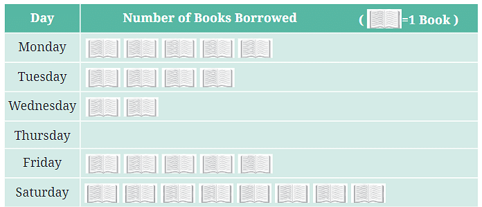
a. On which day were the minimum number of books borrowed?
Ans: The minimum number of books were borrowed on the day with the shortest bar or the fewest symbols in the pictograph.
b. What was the total number of books borrowed during the week?
Ans: To find the total number of books borrowed during the week, add up the number of books represented by the symbols for each day.
c. On which day were the maximum number of books borrowed? What may be the possible reason?
Ans: The maximum number of books were borrowed on the day with the longest bar or the most symbols in the pictograph. The reason could be that students had more free time, or perhaps there was a class activity that required borrowing more books.
Q2: Magan Bhai sells kites at Jamnagar. Six shopkeepers from nearby villages come to purchase kites from him. The number of kites he sold to these six shopkeepers are given below: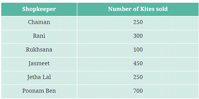
a. How many symbols represent the kites that Rani purchased?
Ans: The number of symbols representing the kites Rani purchased is determined by dividing the total number of kites by the value of each symbol (e.g., if one symbol represents 100 kites, and Rani purchased 300 kites, then she would have 3 symbols).
b. Who purchased the maximum number of kites?
Ans: The shopkeeper who purchased the maximum number of kites is the one with the most symbols in the pictograph.
c. Who purchased more kites, Jasmeet or Chaman?
Ans: Compare the number of symbols for Jasmeet and Chaman to determine who purchased more kites.
d. Rukhsana says Poonam Ben purchased more than double the number of kites that Rani purchased. Is she correct? Why?
Ans: To check if Rukhsana is correct, compare the number of kites Poonam Ben purchased to twice the number of kites Rani purchased. If Poonam Ben’s total is more than double, then Rukhsana is correct.
Page 86
Q1: In Class 2, ___________ students were absent that day.
Ans: In Class 2, 5 students were absent that day.
Explanation: The bar corresponding to Class 2 reaches up to the 5th line on the vertical axis, indicating that 5 students were absent.
Q2: In which class were the maximum number of students absent? ___________
Ans: The maximum number of students were absent in Class 8.
Explanation: The bar for Class 8 is the tallest, reaching up to 7, which means 7 students were absent, making it the class with the highest number of absentees.
Q3: Which class had full attendance that day? ___________
Ans: Class 5 had full attendance that day.
Explanation: The bar for Class 5 does not rise above the baseline (0), indicating that no students were absent, meaning the class had full attendance.
Page 88
Q1: How many total cars passed through the crossing between 6 am and noon?
Ans: The total number of cars that passed through the crossing between 6 am and noon is 4,500 vehicles.
Explanation: We add the number of vehicles from each time interval:
6–7 am: 200 vehicles
7–8 am: 1,200 vehicles
8–9 am: 1,000 vehicles
9–10 am: 900 vehicles
10–11 am: 700 vehicles
11–12 pm: 500 vehicles
Adding these together: 200 + 1,200 + 1,000 + 900 + 700 + 500 = 4,500 vehicles.
Q2: Why do you think so little traffic occurred during the hour of 6–7 am, as compared to the other hours from 7 am to noon?
Ans: The low traffic during the 6–7 am hour could be because it is very early in the morning, and fewer people are on the roads at that time. Most people may not have started their daily activities yet, which is why fewer vehicles are on the road.
Q3: Why do you think the traffic was the heaviest between 7 am and 8 am?
Ans: The traffic was likely the heaviest between 7 am and 8 am because this is a common time for people to commute to work or school. Many people start their day around this time, leading to a higher number of vehicles on the road.
Q4: Why do you think the traffic was lesser and lesser each hour after 8 am all the way until noon?
Ans: The traffic likely decreased each hour after 8 am because most people have already reached their destinations, such as work or school. As the morning progresses, fewer people are traveling, leading to less traffic on the roads.
Page 93
Q1: Samantha visited a tea garden and collected data of the insects and critters she saw there. Here is the data she collected:
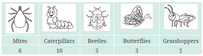
Help her prepare a bar graph representing this data.
Ans: Students are encouraged to answer this question on their own, but here is a sample answer for reference: To prepare a bar graph:
Draw a horizontal axis (X-axis) labeled “Insects/Critters” with each type of insect or critter evenly spaced.
Draw a vertical axis (Y-axis) labeled “Number Seen” with numbers starting from 0 up to the maximum number seen (in this case, 10), evenly spaced.
For each insect or critter, draw a bar that rises to the number seen. For example, the bar for Caterpillars should reach up to 10, while the bar for Grasshoppers should reach up to 2.
Explanation: This bar graph visually represents the number of each type of insect or critter that Samantha observed. It helps in easily comparing the quantities of different types seen in the tea garden.
Q2: Pooja collected data on the number of tickets sold at the Bhopal railway station for a few different cities of Madhya Pradesh over a 2-hour period.
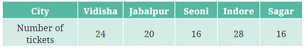
She used this data and prepared a bar graph on the board to discuss the data with her students, but someone erased a portion of the graph.
a. Write the number of tickets sold for Vidisha above the bar.
Ans: The number of tickets sold for Vidisha is 24.
Explanation: According to the data provided, 24 tickets were sold for Vidisha. This number should be written above the corresponding bar on the graph.
b. Write the number of tickets sold for Jabalpur above the bar.
Ans: The number of tickets sold for Jabalpur is 20.
Explanation: The data shows that 20 tickets were sold for Jabalpur. This number should be written above the corresponding bar on the graph.
c. The bar for Vidisha is 6 unit lengths and the bar for Jabalpur is 5 unit lengths. What is the scale for this graph?
Ans: The scale for this graph is 4 tickets per unit length.
Explanation: If the bar for Vidisha (which represents 24 tickets) is 6 units long, then each unit represents 4 tickets (24 tickets ÷ 6 units = 4 tickets per unit). Similarly, for Jabalpur, 20 tickets divided by 5 units also equals 4 tickets per unit.
d. Draw the correct bar for Sagar.
Ans: The bar for Sagar should be drawn with a height of 4 units.
Explanation: Since 16 tickets were sold for Sagar and the scale is 4 tickets per unit length, the bar should be 4 units high (16 tickets ÷ 4 tickets per unit = 4 units).
e. Add the scale of the bar graph placing the correct numbers on the vertical axis.
Ans: The scale should be labeled on the vertical axis, with each unit representing 4 tickets. The numbers would be marked as 4, 8, 12, 16, 20, 24, 28, and so on.
Explanation: This labeling helps in accurately reading the number of tickets sold from the height of each bar.
f. Are the bars for Seoni and Indore correct in this graph? If not, draw the correct bar(s).
Ans: The bar for Seoni should be 4 units high, and the bar for Indore should be 7 units high.
Explanation: Seoni sold 16 tickets, so the bar should be 4 units high (16 tickets ÷ 4 tickets per unit = 4 units). Indore sold 28 tickets, so the bar should be 7 units high (28 tickets ÷ 4 tickets per unit = 7 units).
Page 94
Q1: Chinu listed the various means of transport that passed across the road in front of his house from 9 AM to 10 AM: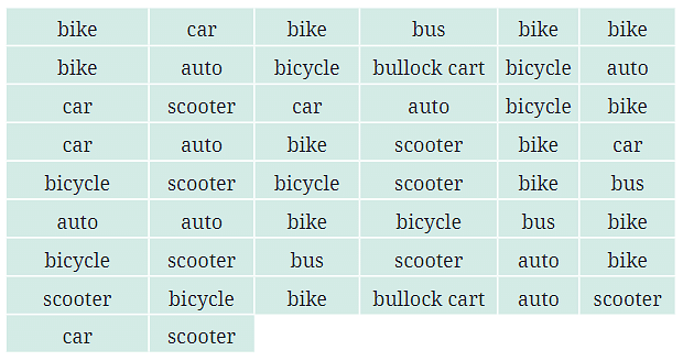
a. Prepare a frequency distribution table for the data.
Ans:
Means of Transport | Frequency |
|---|---|
Bike | 14 |
Car | 7 |
Bus | 4 |
Auto | 8 |
Bicycle | 7 |
Bullock Cart | 2 |
Scooter | 8 |
Explanation: Count the number of times each type of transport appeared in Chinu’s list and enter the frequency in the table.
b. Which means of transport was used the most?
Ans: The bike was used the most, with a frequency of 14.
Explanation: The bike has the highest frequency in the table, indicating it was the most common means of transport observed.
c. If you were there to collect this data, how could you do it? Write the steps or process.
Ans: Students are encouraged to answer this question on their own, but here is a sample answer for reference: To collect this data, you could:
Choose a specific time period to observe (e.g., 9 AM to 10 AM).
Stand at a location where you can clearly see the road.
Record each vehicle you see passing by in a notebook, noting the type of transport.
After the observation period, tally the counts for each type of transport to prepare your frequency distribution table.
Explanation: This process ensures accurate data collection and helps in organizing the information for further analysis.
Q4: Roll a die 30 times and record the number you obtain each time. Prepare a frequency distribution table using tally marks.
Students are encouraged to answer this question on their own, but here is a sample answer for reference:
a. The minimum number of times.
Ans: The number that appeared the least amount of times (which you can determine after recording your results).
Explanation: This is the number with the smallest frequency in your tally marks table.
b. The maximum number of times.
Ans: The number that appeared the most number of times.
Explanation: This is the number with the highest frequency in your tally marks table.
c. Find numbers that appeared an equal number of times.
Ans: Any numbers that have the same frequency in your tally marks table.
Explanation: Compare the frequencies in your table to find the numbers that appeared an equal number of times.
Q5: Faiz prepared a frequency distribution table of data on the number of wickets taken by Jaspreet Bumrah in his last 30 matches:
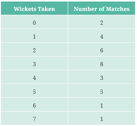
a. What information is this table giving?
Ans: The table shows the frequency of different numbers of wickets taken by Jaspreet Bumrah in his last 30 matches.
Explanation: It tells us how many times Bumrah took 0, 1, 2, 3, 4, 5, 6, or 7 wickets in the matches.
b. What may be the title of this table?
Ans: “Number of Wickets Taken by Jaspreet Bumrah in His Last 30 Matches.”
Explanation: The title should clearly reflect the data presented in the table.
c. What caught your attention in this table?
Ans: Students are encouraged to answer this question on their own, but here is a sample answer for reference: The most striking part is that Bumrah took 3 wickets in 8 matches, which is the highest frequency.
Explanation: It’s interesting to see which number of wickets he most commonly took.
d. In how many matches has Bumrah taken 4 wickets?
Ans: Bumrah took 4 wickets in 3 matches.
Explanation: This information is directly from the table.
e. Mayank says “If we want to know the total number of wickets he has taken in his last 30 matches, we have to add the numbers 0, 1, 2, 3 …, up to 7.” Can Mayank get the total number of wickets taken in this way? Why?
Ans: No, Mayank cannot get the total number of wickets just by adding the numbers 0, 1, 2, 3 … up to 7 because he needs to multiply each number by its corresponding frequency first, then add those results.
Explanation: For example, to calculate the total for the matches where he took 3 wickets, you would multiply 3 (wickets) × 8 (matches) = 24 wickets, and so on for each row in the table.
f. How would you correctly figure out the total number of wickets taken by Bumrah in his last 30 matches, using this table?
Ans: Students are encouraged to answer this question on their own, but here is a sample answer for reference: To find the total number of wickets:
Multiply the number of wickets by the number of matches for each row.
Then add up all these products. For example: (0×2)+(1×4)+(2×6)+(3×8)+(4×3)+(5×5)+(6×1)+(7×1)(0×2)+(1×4)+(2×6)+(3×8)+(4×3)+(5×5)+(6×1)+(7×1)
Explanation: This will give you the total number of wickets taken across all 30 matches.
Q6: The following pictograph shows the number of tractors in five different villages.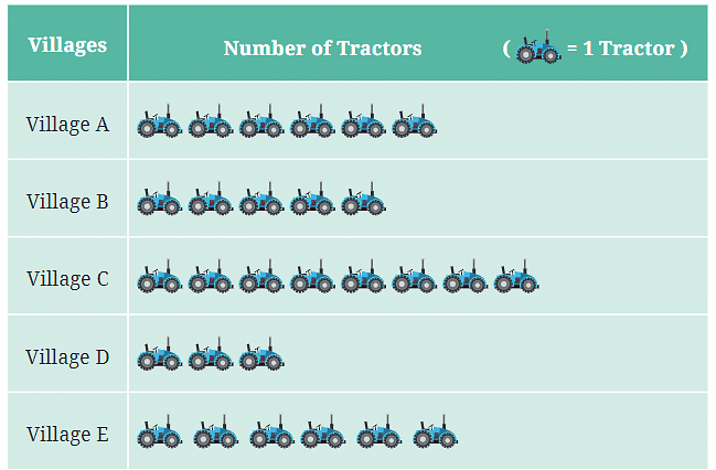
a. Which village has the smallest number of tractors?
Ans: Village D has the smallest number of tractors.
Explanation: The pictograph shows the number of tractors using symbols, and Village D has the fewest symbols.
b. Which village has the most tractors?
Ans: Village E has the most tractors.
Explanation: The pictograph shows the highest number of symbols for Village E.
c. How many more tractors does Village C have than Village B?
Ans: Village C has two more tractors than Village B.
Explanation: Compare the number of symbols in the pictograph to find the difference.
d. Komal says, “Village D has half the number of tractors as Village E.” Is she right?
Ans: Yes, Komal is correct.
Explanation: If you compare the symbols, Village D has half the number of symbols as Village E, meaning it has half the number of tractors.
Q7: The number of girl students in each class of a school is depicted by a pictograph: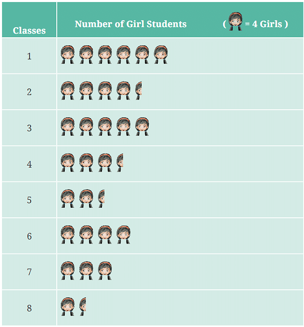
a. Which class has the least number of girl students?
Ans: Class 8 has the least number of girl students.
Explanation: The pictograph shows the smallest number of symbols for Class 8.
b. What is the difference between the number of girls in Class 5 and 6?
Ans: There are 4 more girls in Class 6 than in Class 5.
Explanation: By counting the symbols for each class, you can determine the difference.
c. If 2 more girls were admitted in Class 2, how would the graph change?
Ans: The pictograph would show one additional symbol for Class 2, assuming each symbol represents 2 girls.
Explanation: Adding 2 more girls would increase the count and require an additional symbol.
d. How many girls are there in Class 7?
Ans: There are 8 girls in Class 7.
Explanation: Count the number of symbols in the pictograph for Class 7.
Q8: Mudhol Hounds (a type of breed of Indian dogs) are largely found in North Karnataka’s Bagalkote and Vijaypura districts. The government took an initiative to protect this breed by providing support to those who adopted these dogs. Due to this initiative, the number of these dogs increased. The number of Mudhol dogs in six villages of Karnataka are as follows:
![]()
a. What will be a useful scale or key to draw this pictograph?
Ans: Students are encouraged to answer this question on their own, but here is a sample answer for reference: A useful scale would be 1 symbol = 6 dogs.
Explanation: This scale is a good choice because it divides evenly into the numbers provided (e.g., 18 dogs would be 3 symbols, 36 dogs would be 6 symbols, etc.).
b. How many symbols will you use to represent the dogs in Village B?
Ans: 6 symbols will be used to represent the dogs in Village B.
Explanation: Since each symbol represents 6 dogs, and Village B has 36 dogs, you would use 6 symbols (36 ÷ 6 = 6).
c. Kamini said that the number of dogs in Village B and Village D together will be more than the number of dogs in the other 4 villages. Is she right? Give reasons for your response.
Ans: Yes, Kamini is correct. The combined total of dogs in Village B and Village D is 84 (36 + 48). The total for the other four villages is 72 (18 + 12 + 18 + 24). Therefore, 84 is greater than 72, so Kamini is right.
Q9: A survey of 120 school students was conducted to find out which activity they preferred to do in their free time.
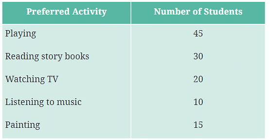
Draw a bar graph to illustrate the above data taking the scale of 1 unit length = 5 students. Which activity is preferred by most students other than playing?
Ans: Students are encouraged to answer this question on their own, but here is a hint for reference: To draw the bar graph:
Draw the X-axis labeled with the activities (Playing, Reading story books, Watching TV, Listening to music, Painting).
Draw the Y-axis labeled with the number of students, using a scale where 1 unit = 5 students.- Draw bars for each activity according to the number of students:
Playing: 9 units (45 students)
Reading story books: 6 units (30 students)
Watching TV: 4 units (20 students)
Listening to music: 2 units (10 students)
Painting: 3 units (15 students)
Explanation: After drawing the graph, it’s clear that Reading story books is the most preferred activity after Playing.
Q10: Students and teachers of a primary school decided to plant tree saplings in the school campus and in the surrounding village during the first week of July. Details of the saplings they planted are as follows:
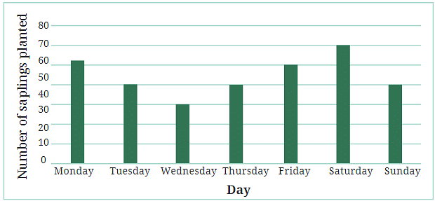
a. The total number of saplings planted on Wednesday and Thursday is ___________.
Ans: The total number of saplings planted on Wednesday and Thursday is 70.
Explanation: Add the saplings planted on Wednesday (30) and Thursday (40) to get 70.
b. The total number of saplings planted during the whole week is ___________.
Ans: The total number of saplings planted during the whole week is 280.
Explanation: Add the saplings planted each day: 10 + 20 + 30 + 40 + 50 + 60 + 70 = 280.
c. The greatest number of saplings were planted on ___________, and the least number of saplings were planted on ___________.
Ans: The greatest number of saplings were planted on Sunday, and the least number of saplings were planted on Monday.
Explanation: Sunday has the highest number (70 saplings) and Monday has the lowest (10 saplings).
Q11: The number of tigers in India went down drastically between 1900 and 1970. Project Tiger was launched in 1973 to track and protect tigers in India. Starting in 2006, the exact number of tigers in India was tracked. Shagufta and Divya looked up information about the number of tigers in India between 2006 and 2022 in 4-year intervals. They prepared a frequency table for this data and a bar graph to present this data, but there are a few mistakes in the graph. Can you find those mistakes and fix them?
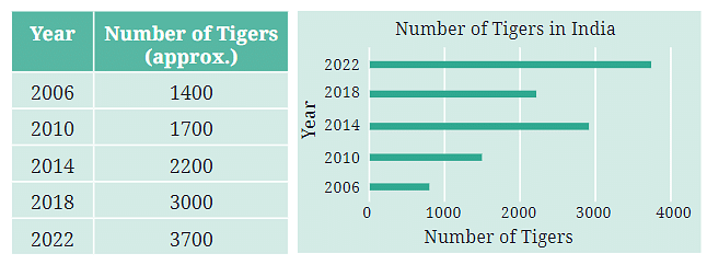
Ans: To correct the bar graph:
- Ensure that the bars are drawn with the correct heights corresponding to the numbers in the table.
2006: 1400 (bar height should correspond to 1400)
2010: 1700 (bar height should correspond to 1700)
2014: 2200 (bar height should correspond to 2200)
2018: 3000 (bar height should correspond to 3000)
2022: 3700 (bar height should correspond to 3700)
Check that the scale on the Y-axis matches the numbers provided.
Correct any inconsistencies in the graph where the height of the bars doesn’t match the number of tigers.
Explanation: The bar graph should accurately represent the data from the table without any discrepancies.
Page 103
Q1: If you wanted to visually represent the data of the heights of the tallest persons in each class in your school, would you use a graph with vertical bars or horizontal bars? Why?
Ans: Students are encouraged to answer this question on their own, but here is a sample answer for reference: I would use a graph with vertical bars.
Explanation: Vertical bar graphs are often easier to read and compare when dealing with numerical data like heights. Each class can be represented on the horizontal axis (X-axis), and the height of the tallest person in each class can be represented on the vertical axis (Y-axis). This makes it easy to compare the heights visually.
Q2: If you were making a table of the longest rivers on each continent and their lengths, would you prefer to use a bar graph with vertical bars or with horizontal bars? Why? Try finding out this information, and then make the corresponding table and bar graph! Which continents have the longest rivers?
Ans: Students are encouraged to answer this question on their own, but here is a sample answer for reference: I would prefer to use a bar graph with horizontal bars.
Explanation: Horizontal bar graphs are often better for displaying data where the categories (in this case, continents) have longer names or when there are many categories to compare. The continents can be listed on the vertical axis (Y-axis), and the lengths of the rivers can be represented on the horizontal axis (X-axis). This format makes it easier to compare the lengths of the rivers across different continents.
Continents with the Longest Rivers:
- Africa: Nile River (approximately 6,650 km)
- South America: Amazon River (approximately 7,000 km)
- Asia: Yangtze River (approximately 6,300 km)
- North America: Mississippi-Missouri River System (approximately 6,275 km)
- Europe: Volga River (approximately 3,530 km)
- Australia: Murray-Darling River System (approximately 3,672 km)
Table Example:
Continent | Longest River | Length (km) |
|---|---|---|
Africa | Nile River | 6,650 |
South America | Amazon River | 7,000 |
Asia | Yangtze River | 6,300 |
North America | Mississippi-Missouri | 6,275 |
Europe | Volga River | 3,530 |
Australia | Murray-Darling | 3,672 |
Bar Graph:
You can create a horizontal bar graph with continents on the Y-axis and river lengths on the X-axis to visually represent this data.